Client: Information Governance Solutions (IGS)
Project: Virgo
Background
IGS is a leader in the Records Information Management (RIM) space. RIM is concerned with the management of corporate documents. Imagine that you are running a multi-national corporation. You have operations across the globe in a very large number of jurisdictions. Each of these jurisdictions has different laws and regulations about what kinds of records you are required to keep, and for how long. How do you know what to keep, and for how long? Enter IGS. They provide consulting services to help firms understand their responsibilities and be sure that they are compliant. This work usually results in a comprehensive document called a "Records Schedule".
Need
IGS was ready to take the next step beyond consulting and manual processes, and wanted to build an application that would allow their customers to easily manage their Records Schedule on their own. This would also allow IGS to expand their customer base more rapidly, as well as enhance the experience of existing customers. IGS was working on a API for the databases they were providing to their customers, but needed a client application designed and built to access this API.
Requirements
- Users should not need to install anything.
- The application must be very fast, while also handling very large datasets.
- Users may only interact with this application a few times per year, so the user interface must be intuitive and familiar.
- Users should not need to click more than two or three times to find the information they are looking for.
- The application must be secure.
Process
In an ideal project, we would follow a series of consecutive phases that build upon each other like this:
- Define business goals
- Write user stories that fulfill business goals
- Iterate on user stories
- Write technical requirements that fulfill business goals and enable user stories
- Create wire frames that implement user stories, and describe workflow
- Conduct A/B testing with potential users using wireframes
- Incorporate feedback
- Iterate on wireframes
- Create high fidelity UI designs
- Implement UI designs and build application
- Conduct A/B testing on alpha version of application
- Incorporate feedback
- Make beta release
- Continue to iterate based on user feedback. Repeat this step until product is retired or replaced
A Slight Detour
Virgo was the second large project I created for IGS. When I first started working with them, I had been hired me to implement a Web-based customer engagement portal. The primary purpose of this application was to connect with new customers, and manage existing customer relationships, though there was some overlap of what was later to become Virgo.
Prior to my engagement, IGS had already designed interfaces and a workflow, so my job was to build a usable web application from these designs. Therefore, the first task was a technology assessment.
We knew it would need to be Web-based. At the time, I was most familiar with the LAMP (Linux, Apache, MySQL, PHP) stack, so my first instinct was to build the application using that. However, IGS had a strong interest in making the application have a desktop application feel. At that time, a variety of JavaScript MVVM frameworks were emerging, so I did a technology assessment. With frameworks like Sencha, Ember, Backbone, Knockout, React, and Angular, it appeared possible to build a great experience entirely with JavaScript. This design has come to be known as a Single Page Application (SPA). The idea is that instead of having the server handle the assembly of views, this is all handled within the client (the browser). The server sends the JavaScript, HTML, and CSS on the first request, and from then on, the application requests only data in the form of JSON responses from the API. This dramatically speeds up response times, and gives the application a more fluid feel.
After evaluating a variety of JavaScript frameworks, Angular was chosen as the framework of choice. Some of the benefits of Angular are:
- It is a comprehensive framework covering all of the essential functionality we were looking for.
- It is built for non-trivial applications, as we were planning on building.
- It has a thriving community surrounding it, so it seemed unlikely to disappear any time soon.
- It is published by Google, so that can’t hurt. Google is definitely not going away any time soon.
The resulting technology stack consisted of these parts:
- Angular + Twitter Bootstrap frameworks were used to fashion the front end.
- A combination of Node and Express for a Web and proxy server.
- The proxy server in turn communicates with the IGS REST API.
The customer engagement portal was mostly complete, when IGS realized they wanted to expand on the idea dramatically, and build a comprehensive tool for Records Information Management. This project became Virgo.
Back to Virgo
The point of that detour was to explain that, when we started the Virgo project, we already had a technology stack in place that worked. But, we decided to start over from scratch with almost everything else. This excited me, because I would then be able to work with my client to fashion the best possible experience from beginning to end. So, we dug in to the process as described above:
Define Business Goals and Write User Stories
The first step was to get all of the executives together in a meeting to hammer out coherent business goals for Virgo. I asked a lot of questions and took a lot of notes. At this stage, the very best thing would be to start interviewing end users, who in this case would be the customers of IGS. However, as is often the case, it was difficult to obtain access to these individuals. So it was necessary to rely on the expertise of my client, and their deep understanding of their own customers. From this discussion, I wrote up an initial set of high-level user stories. User stories, if you are unfamiliar with the term, are short descriptions of something that the application should do, from the perspective of a particular type of user. I prefer a format taken from Agile software development practices, which goes like this:
As a _______, I want to _______ [, so that I can _______].
The last part is optional, if needed for context.
The point of this format is that it forces the writer of the story to distill the feature down to it's most essential parts: Who is doing this? What are they doing? Why? The simple and plain format ensures a minimum of jargon, so that all stakeholders can easily understand the story.
The stories are also hierarchical. We started with high level stories and then drilled down to the nitty gritty. The first round of stories I wrote were very high level, and went something like this:
As a user, I want to view, edit, and publish the Records Schedule, so that I can manage my records retention effectively.
I showed this first round of high level stories to the client so that they would understand the concept of user stories. I then asked them to help me understand and classify all of the different types of users for the application. We came up with the following types of users:
- Records Manager. This user is the primary user of the application.
- Administrator. An end user, who is mainly concerned with who has access to the application, since it is billed on a per seat basis.
- Collaborator. This would anyone who is interested in reading the Records Schedule, but would not have permissions to create, edit or delete a Records Schedule.
- Developer. (that would be me, or anyone else working on the application)
- Owner. (The owner of the application - IGS, in this case)
I then wrote up a second round of user stories using these user types. These went something like this:
As an administrator, I need to be able to manage other users, so that I can manage who has access to the application.
When appropriate, I would create children of these stories to get more fine grain detail. For example, the above story might spawn a few more stories such as:
As an administrator, I need to be able to create a new user, so that I can add new members to the team.
As an administrator, I need to be able to change the user type of existing users, so that I can control access to the application.
At this point, I shared my user stories with IGS, and asked them to contribute their own stories if they felt that my efforts had missed any key features.
We kept drilling down and iterating until we felt we had covered all of the use cases we could imagine. We then had a set of narratives that, when read as a whole, described the entire application in a way that anyone could understand. The next step was to build visuals that fulfilled the promise of these stories.
Wireframes
Back at RISD, we had a graphic design professor who constantly admonished, "Sketch! Sketch! Sketch!" In his mind, students were too quick to run to the computer to pump out what looked like polished, finished designs, before exploring the many possibilities. By restraining oneself from the computer, and working with pencil, pen and paper, one can fluidly explore designs in a rapid fashion, discovering quickly what works, what doesn't, and experimenting with almost no cost. I have found this to be true, and embrace the ethos to this day.
Therefore, as I sat down with my user stories and attempted to turn them into user interfaces, my tools were simple: a No. 2 pencil, and a stack of letter sized paper. My sketches looked something like this:
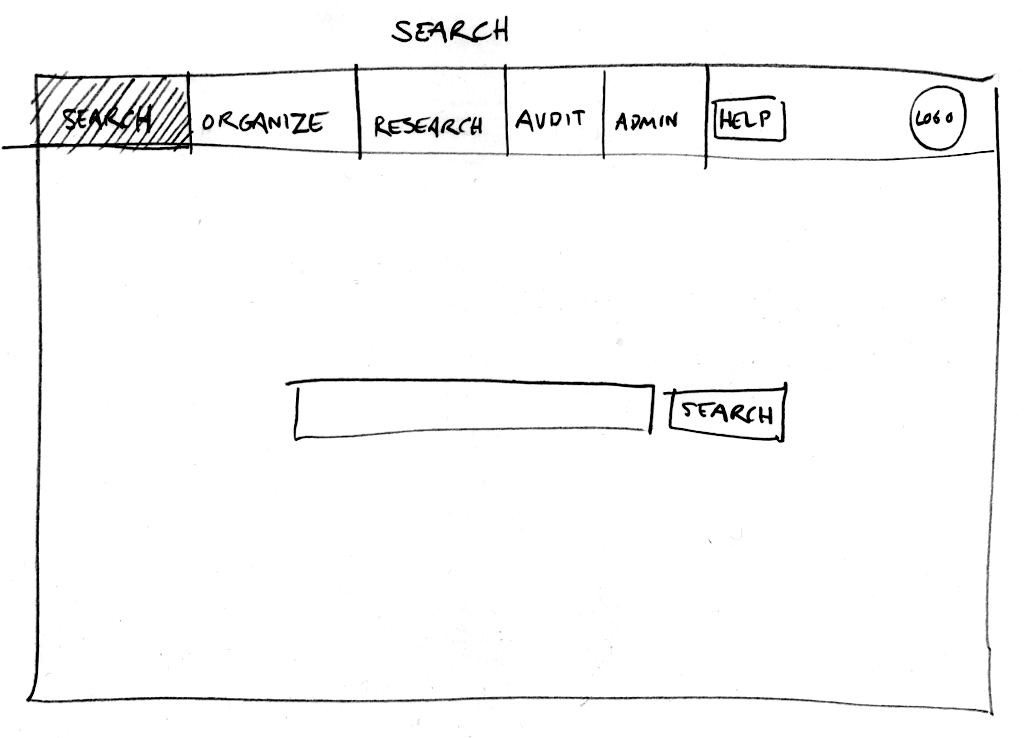
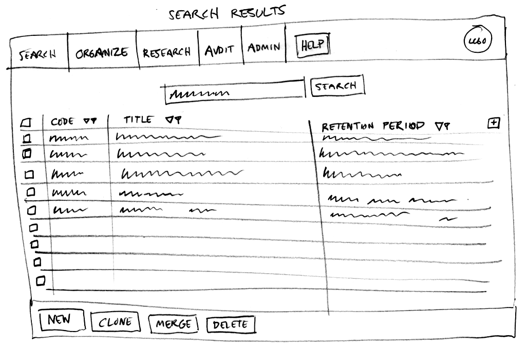
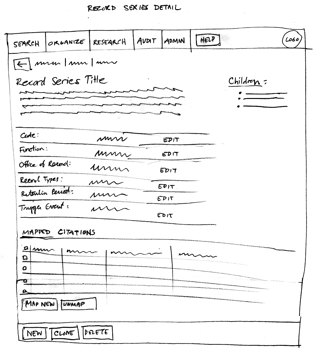
After messing about in pencil for a while, an overall design begins to emerge. When I am happy with the results, then I start to work on clean wireframes using Adobe Illustrator and InDesign. Illustrator is great for whipping up all kinds of shapes, and InDesign is great for iterative pages that share a number of elements. Here are two examples of the first round of wireframes, the first one showing what a user would see after first logging in, and the second an example of a search result view:
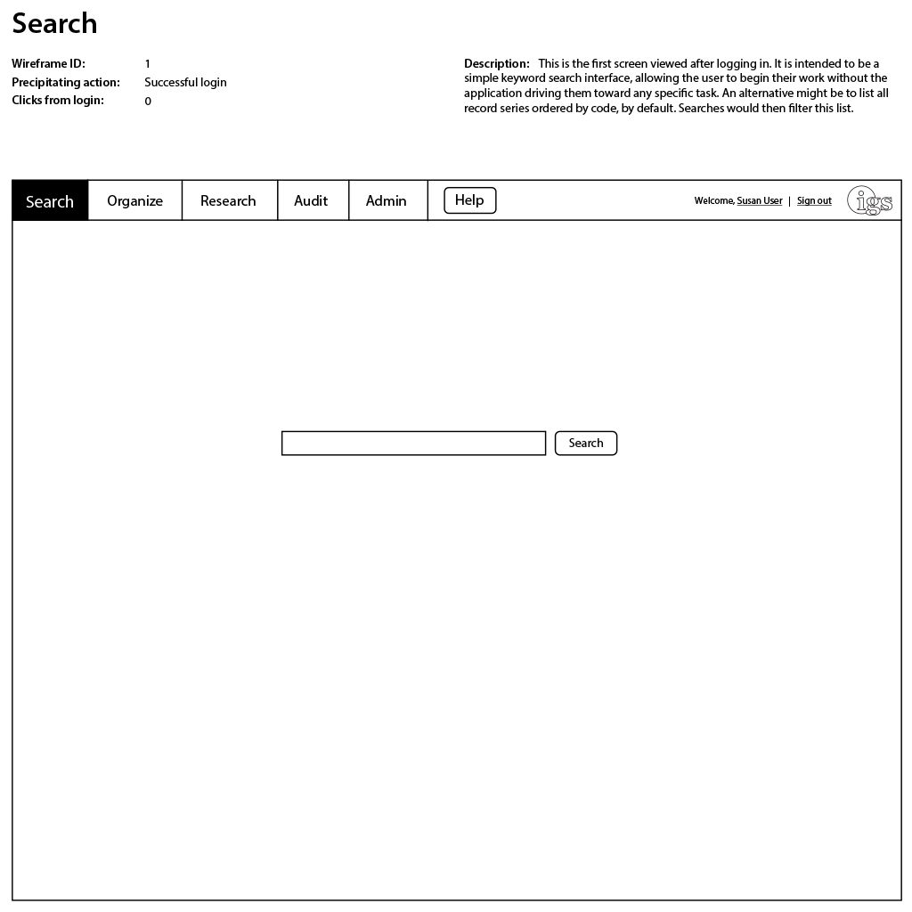
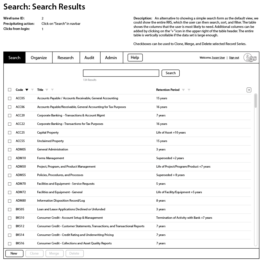
As can be seen, each wireframe has the following information attached:
- Title
- ID
- Precipitating action: The thing that the user did in order to display this view.
- Clicks from login: The shortest number of interactions that a user could have taken to arrive at this view after the login action.
- Description: An explanation of what is going on in the wireframe.
This is the stage at which a first round of wireframes are sent to the rest of the team for review. I have found that for wireframes, it is important to strike a balance of refinement. If they are too rough (like the pencil sketches), it is hard for others to judge them effectively. If they are too polished (such as a polished interface produced in Photoshop), you end up spending too much time on them, and get attached to the design. You want people to be able to imagine a finished interface in their heads, but at the same time feel free to completely scrap ideas if they are not working.
After the team has reviewed, we discuss them as a group. Ideally, we would get feedback from anticipated end users as well. It would even be useful to begin A/B testing at this point, if budget, time, and access allowed. But, these things are not always possible, especially at this early stage. Taking the team feedback, we create another round:
And again:
A Few Words About Design Choices
Throughout the process we were constantly re-evaluating our design choices as we saw them in action, and especially when we got feedback from users. What follows are some notes on just a few features that we considered.
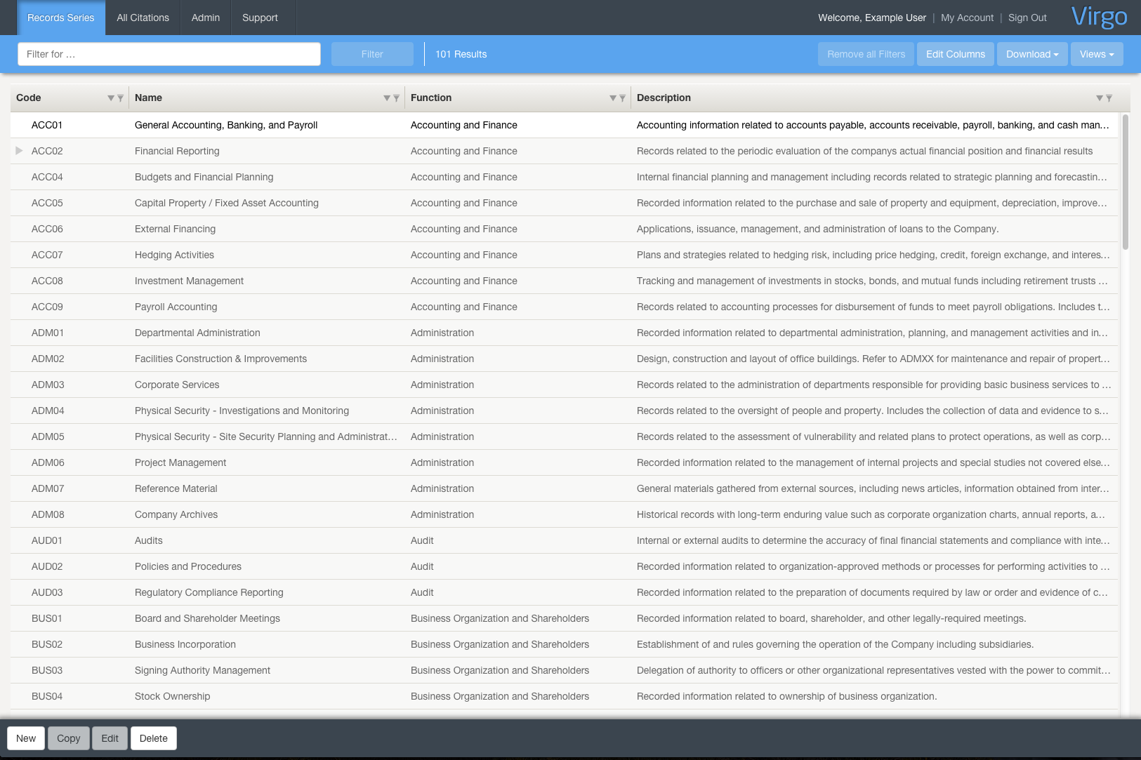
At the early wireframe stage, we had a default view that consisted of a large empty interface with a single search field, similar to the Google search interface. This was replaced with a default view of the Records Schedule table. We realized during the wireframing process that the vast majority users want to see the Records Schedule immediately. Since this dataset is usually not enormous (typically only a few hundred rows), users would probably rather scan through it than perform a search. This also leads to another design decision …
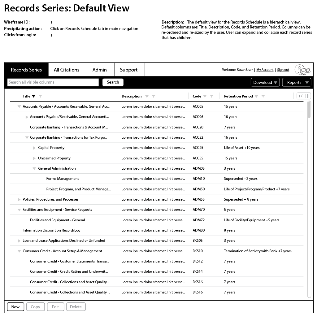
It will be noted that the main interface closely resembles a typical spreadsheet design. There are reasons for this:
- Before Virgo, most of the work in this area was done using spreadsheet applications such as Excel. We wanted our users to be immediately familiar with Virgo, even if it was a new experience.
- Users are not likely to be using the application daily, and would need to be productive in the application easily, without having to re-learn any complex interactions after having been away for a long period of time. Therefore, we wanted the interface to resemble other applications that the user is likely to be familiar with.
Taking Shape
After several rounds of iterations - in this case there were 7 - a general consensus emerges that we are close enough to take the next step. Often times, this next step will be for a designer to complete high fidelity designs in Photoshop. This is one area where being a developer and designer saves a bit of time. Since I feel as fluid in CSS as I do in Photoshop, it saves a lot of time to start coding right away - though I limit myself to just HTML and CSS right now. I want to get the general look and feel down before diving deep into the JavaScript:
After a few iterations at this stage, with feedback from the team at each round, we have a color scheme and a look and feel that everyone is excited about.
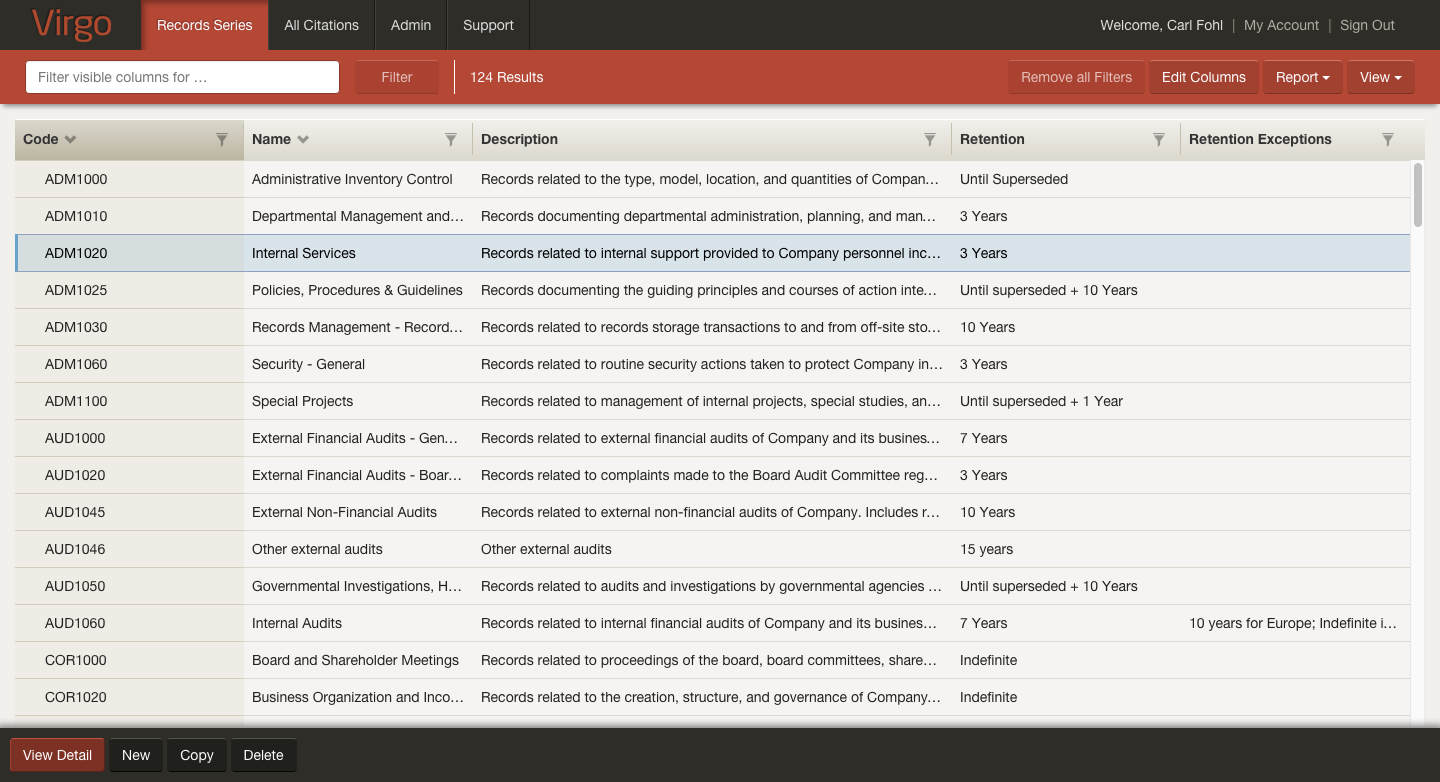
Over the next several months, the application begins to gradually emerge. The IGS team is also gradually exposing the application to select customers who have agreed to give feedback. This feedback is incorporated into the user experience design as we go. Again, ideally, we would be A/B testing here, but that is not always possible given the constraints faced by the client. Regardless of what exact methods are used, the key is to be constantly getting feedback in some way from end users, and iterate, iterate, iterate. Therefore, in software, there really is no “final” product - there is just the current state. As of this writing, the main interface of the application looks like this:
Currently, Virgo is being used as part of several corporations' workflow. Users have reported back that the software is a delight to use, and a refreshing experience in an area where user experience has not often been a priority. This is, in turn, a delight for me to hear. I am grateful for IGS to have invested in this process, which I believe has produced a product superior to its competitors.